Sells a plan, not a panic
The old page listed services. The redesign sells the thing a plumber can actually put on a subscription, and puts the price where you can see it without ringing to ask.
Both halves are live, and you can open either one
The same plumber, the same services, the same budget. Rebuilt around what a trade business actually sells, then measured rather than described.
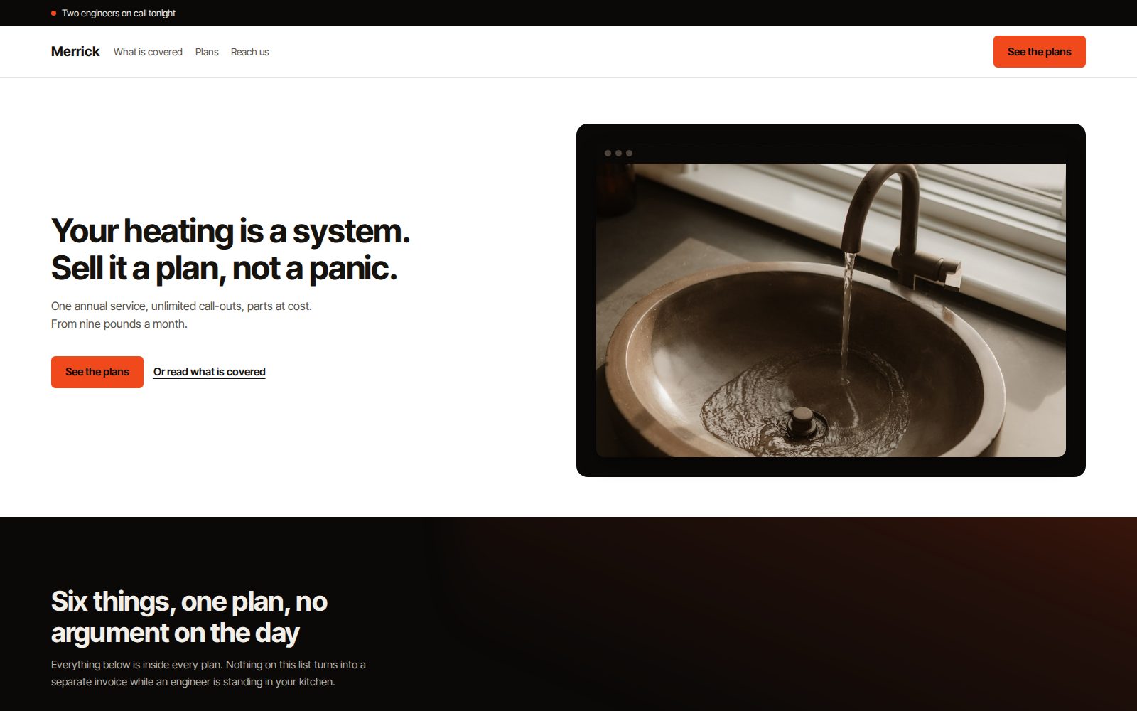
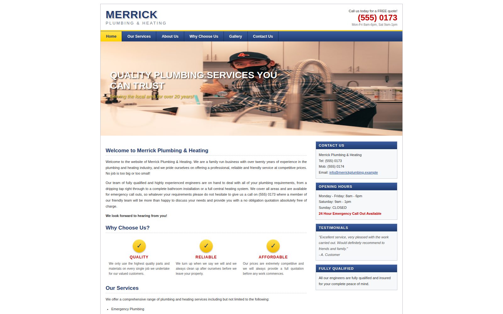
Not that it was ugly. Plenty of ugly sites make money. Every row below is a rule an automated checker applies to any page. The bar is how many times the original broke it. The redesign breaks none of them.
On top of those, the original overflows sideways on a phone: a fixed canvas with no viewport tag, on the device where most plumbing searches actually happen, often while something is going wrong.
The old page listed services. The redesign sells the thing a plumber can actually put on a subscription, and puts the price where you can see it without ringing to ask.
Six named systems in a house, each one drawn and labelled, all resolving to one plan. A maintenance plan normally fails because nobody can picture what is inside it.
What is not covered, and that you can leave on a month's notice, stated on the page rather than buried in terms nobody opens.
Three plans, identical in structure, with the middle one carrying the only solid button. No badge, no ribbon, no second colour shouting recommended.
Both pages went through the same automated design and accessibility checks, in a real browser, at 390 pixels wide and 1440 pixels wide. This is the difference in numbers rather than adjectives.
| Check | Before | After |
|---|---|---|
| Text below the legible size floor | 21 | 0 |
| Justified text without hyphenation | 8 | 0 |
| Undersized interface text | 7 | 0 |
| Lines longer than 80 characters | 6 | 0 |
| Colour contrast failures | 3 | 0 |
| Everything else the checker flags | 4 | 0 |
| Total automated findings | 49 | 0 |
| Text sitting on a photograph unplated | 12 | 0 |
| Horizontal overflow on a phone | Yes | No |
The first seven rows are one detector, run against both live URLs. The last two come from a separate rendering probe that composites text colour through every ancestor's opacity and measures real line boxes, because a checker reading declared CSS values will report contrast that the screen never actually shows.
This is the work. Hand coded, no template and no page builder, and you get a live URL to open on your own phone before anything is agreed.